
Your lead magnet could solve your audience’s biggest problem, but if the page selling it feels unclear or overwhelming, people will leave. They’ll glance at your offer, think “I’ll come back to this later,” and never return.
That’s why a dedicated landing page is the bridge between having a great resource and actually building your email list with it.
Unlike your homepage or blog posts, a lead magnet landing page strips away every distraction and focuses on one goal: helping visitors decide if your free resource is worth their email address.
Key Takeaways
- More than half of all landing page submissions (55%) come from lead magnets, showing that they remain the most trusted entry point for B2B audiences.
- Seven elements form the backbone of a high-converting page: headline, subheadline, value-focused description, visuals, proof, opt-in form, and CTA.
- Real-world examples show that both long-form and short, above-the-fold pages can work when the copy is clear and the promise is strong.
- Small optimizations, from SEO and page speed to testing CTAs, compound over time to boost conversions.
What Makes a Lead Magnet Landing Page Different?
Lead magnet landing pages operate differently from other types of conversion pages.
A demo request page is asking for a meeting. A product page prompts a purchase. A pricing page requests a subscription.
But a lead magnet landing page is asking for trust and proving you’re worth it.
Here’s what sets them apart:
- Single conversion goal. Everything on the page drives toward one action: getting the resource. No navigation menu, no competing CTAs, no sidebar offers. Just one clear path forward that removes decision paralysis.
- Value-first messaging. Since you’re not asking for money, your copy focuses entirely on what people gain. The transformation they’ll experience. The time they’ll save. The results they can expect.
And because of that, they tend to outperform because more than half of all landing page submissions (55%) come from lead magnets. Think of it as the handshake before the conversation. If it’s clear, confident, and valuable, visitors are far more likely to lean in.
The 7 Elements of a High-Converting Lead Magnet Landing Page
Every strong lead capture landing page follows the same backbone. Write these seven pieces well, and your page will do its job.
1. Headline that promises an outcome
Your headline is the five-second test. Visitors land on the page and instantly decide if this is worth their attention. That’s why it can’t just name the resource — it has to make a promise.
Instead of “Download Our Guide”, use something outcome-focused like “Find the SEO gaps costing you traffic.” Even better are headlines with a time frame or clear result, like “The 5-Minute Website Audit That Finds Your Biggest Conversion Killer.”
The job of the headline is to get them to keep reading. If it communicates value immediately, the rest of your page has a chance to work.
2. Subheadline that clarifies who it’s for
The headline draws attention. The subheadline qualifies it. This is where you make the reader think, “This is for me.”
For example: “A 15-point checklist built for eCommerce teams managing large product catalogs.”
This extra line filters out casual readers and reassures your ICP that they’ve landed in the right place.
3. Value-driven description
Once you’ve hooked attention, readers want more detail. This is the copy that explains what the resource is and why it matters.
Keep it concise and benefit-led. Bullets can help make this section scannable. Aim to paint a picture of what life looks like after using your lead magnet.
4. Visuals that make it tangible
Even digital assets perform better when they look real. A mockup of a report cover, a screenshot of a template, or a preview of a toolkit adds credibility.
The goal isn’t flashy design. It’s to help people picture themselves using the resource, which makes it feel more substantial.
5. Proof or authority signals
Handing over an email is a small risk. Proof reduces the hesitation.
This could be a simple download counter (“Trusted by 2,000+ marketers”), a short testimonial, or logos of companies already using your resource. Even one credibility cue makes the exchange feel safer.
6. Frictionless opt-in form
The form is where interest turns into action, and it has to feel effortless. The fewer fields, the better.
Most of the time, simply asking for a name and email address is enough. Anything beyond that adds friction and lowers conversions. Keep the form clean and mobile-friendly so it feels quick to complete.
This is also the right place to address the fear of spam, so a short reassurance can go a long way toward easing hesitation.
7. Action-focused CTA
Your CTA button is the last piece of copy they see before deciding. Treat it like a mini-headline, not an afterthought.
Replace vague copy, such as “Submit,” with action-focused text tied to the benefit: “Send Me the Checklist” or “Show Me the Playbook.” These subtle shifts make the click feel like a reward instead of a chore.
These are the pieces every page needs. To see them in action, let’s look at a few real lead magnet landing pages and how they’ve put these principles to work.
Lead Magnet Landing Page Examples
Here are a few lead magnet landing pages from well-known B2B brands that show different ways to structure copy, visuals, and forms.
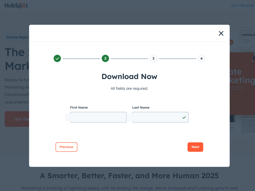
1. HubSpot’s 2025 State of Marketing Report
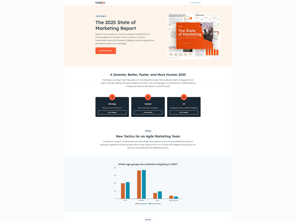
What makes this page effective is how quickly it communicates both authority and urgency. By adding “2025,” it signals timeliness, while the HubSpot brand itself carries instant credibility for marketers.
The copy directly under the headline does the heavy lifting. Instead of vague claims, it tells readers what they’ll actually get: a guide to AI innovation, consumer shifts, and smarter, more human marketing.
That immediate framing makes the report feel necessary, not optional.
The visuals help too. By showing the report cover and inner pages, HubSpot turns an intangible download into something that looks real and substantial.
Finally, the opt-in process feels approachable. The CTA button is action-oriented (“Get the trends”), and while the form is spread across multiple steps, each screen only asks for simple details, keeping friction low.
Pages like this work because they make the resource feel current, credible, and easy to grab. These are the same three ingredients you can bring into your own landing page, whatever format you’re offering.
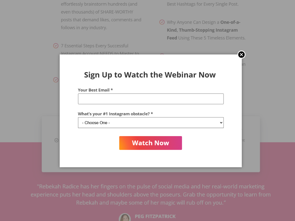
2. Tailwind’s Free Instagram Strategy Webinar
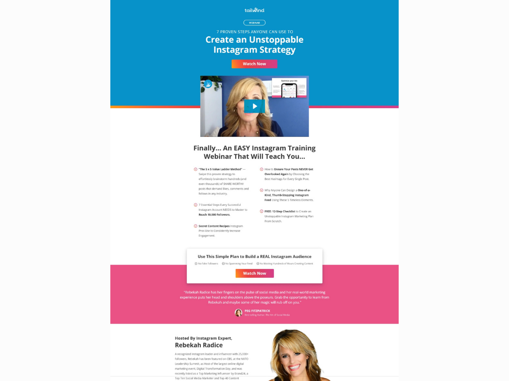
This page gets straight to the point with a headline that’s specific, benefit-led, and tailored to its audience. It promises “7 Proven Steps” and an “Unstoppable Instagram Strategy” — language that speaks directly to their target leads, who seek growth and confidence on the platform.
The inclusion of a video at the top is also a smart choice. People connect with a face, and studies show just having a video on your landing page can boost conversions by over 86%.
What’s nice here, too, is that they spell out exactly what you’ll get from the webinar. The bullet list makes it easy to scan, and the testimonial, plus the expert host at the bottom, give it credibility.
And the form couldn’t be easier: just an email and a quick drop-down. This keeps friction minimal while still allowing Tailwind to segment their audience by interest.
If you’re putting together your own page, this is a good model to follow: keep the promise sharp, use video or visuals to humanize it, share proof, and make the opt-in as simple as possible.
3. Salesforce’s Free B2B Marketer’s Guide
Unlike some resource pages that make you scroll through long sections of persuasion, Salesforce keeps this one tight and focused. Everything you need to understand the offer is above the fold.
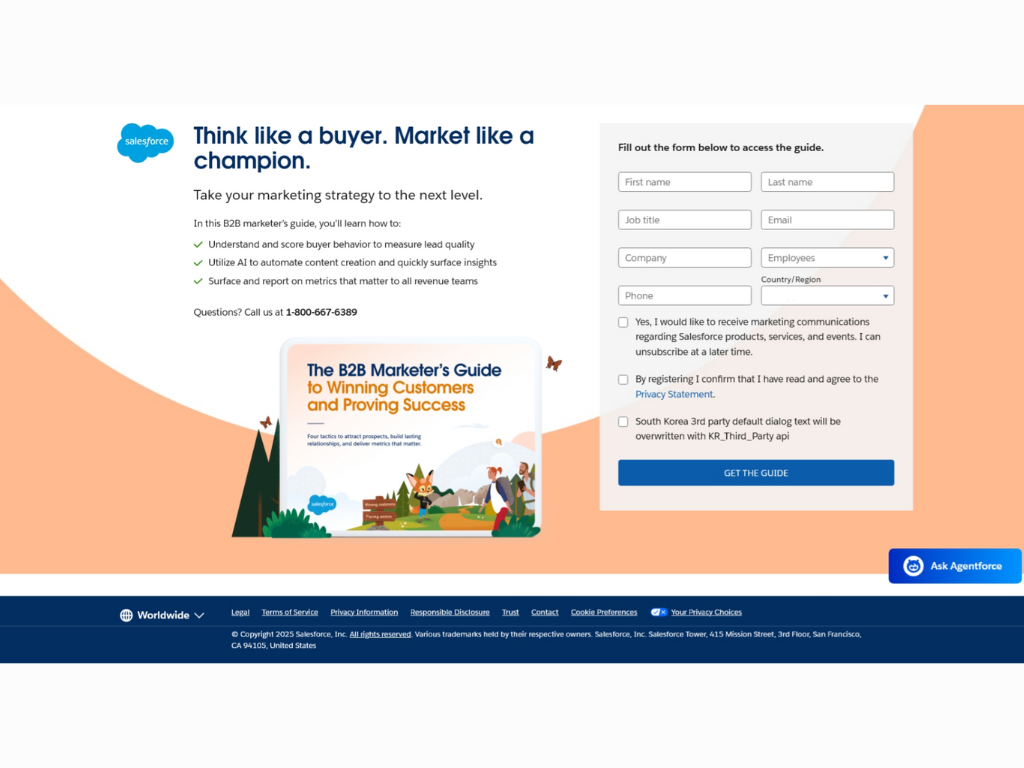
The headline is short, motivational, and immediately signals who this is for. Underneath, three sharp bullet points explain exactly what you’ll learn.
Placing the form right alongside the copy also reduces friction. There’s no scrolling, no searching — just a simple invitation to trade details for the guide.
This is proof that you don’t need pages of persuasion to sell a lead magnet. If your value prop is strong and clear, sometimes the best move is to say less and make it easy to act.
4. HubSpot’s Free AI Prompts
Another example from HubSpot shows how you can go beyond persuasion and build trust (not just through testimonials). This landing page promotes their “20 Prompts to Scale Your Marketing Without Scaling Your Team,” but what really makes it stand out is the way it anticipates reader hesitation.
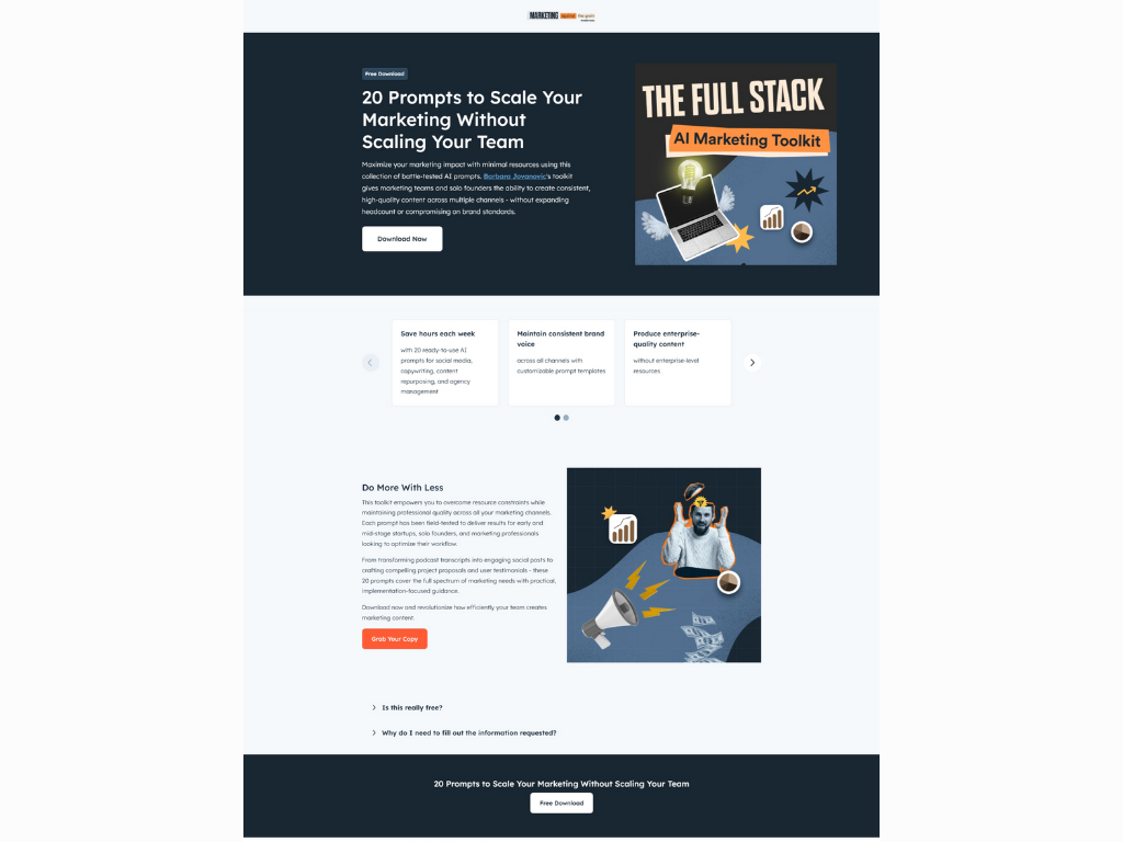
Alongside the usual headline, benefits, and visuals, HubSpot includes a short FAQ section at the bottom. It directly answers two questions almost everyone has before handing over their details:
- “Is this really free?”
- “Why do I need to fill out the information requested?”
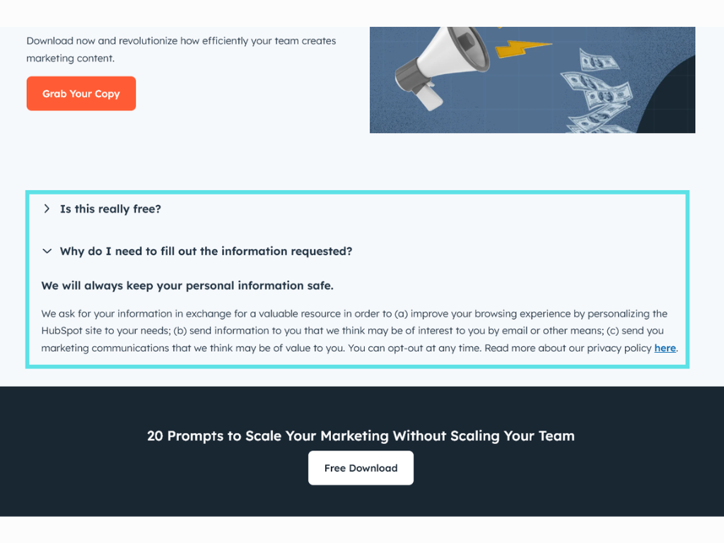
It’s a small addition, but it makes a difference. Many prospects worry about being spammed or misled when asked for their email. By addressing those objections upfront, HubSpot removes friction and reinforces credibility.
5. AdEspresso’s Free Trial Offer
AdEspresso also keeps its landing page short, sharp, and above the fold. Yet, it still hits the essentials.
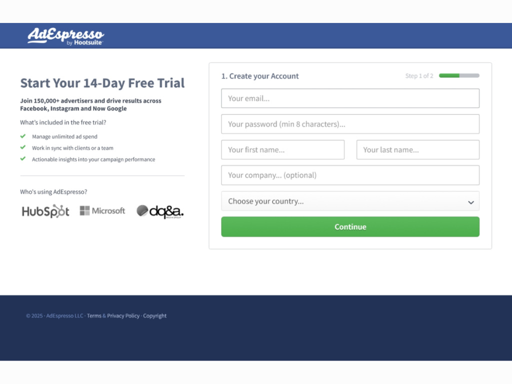
The headline promises value upfront, the bullets translate features into benefits, the logos provide instant authority, and the CTA is clear. Nothing extra, nothing distracting.
This shows the power of restraint. If your audience already has intent, then a short, focused landing page like this can often outperform longer ones.
Next-Level Optimization Tips to Lift Conversions
Beyond the core elements, these small optimizations can have a meaningful impact on your conversion rates:
- Think about search visibility. If someone’s Googling for a checklist, template, or report, you want your page to show up. A clear keyword in the headline, a focused meta description, and a bit of supportive copy (300 words or so) give your landing page a better chance to attract organic traffic.
- Check speed and mobile experience. Pages that load slowly tend to lose visitors before they’ve even seen the offer. It’s helpful to run a quick test using tools like Google PageSpeed Insights and to always open the page on your own phone to see how it performs.
- Keep the design simple. You don’t need a flashy layout. A clean, consistent look, whether from a template in Leadpages, Unbounce, or WordPress, often works best because it keeps attention on your message.
- Align with your traffic source. When someone clicks from a Facebook ad about “email marketing tips,” the landing page headline should reflect that same promise. A clear connection reassures visitors they’re in the right place.
- Experiment and refine. Testing small things, like CTA button text or headline phrasing, can lead to meaningful gains. Over time, even minor improvements add up to noticeably higher conversions.
Turning visitors into subscribers isn’t luck
A great lead magnet deserves a landing page that does it justice. When you strip away distractions, focus on the outcome, and guide readers step by step through the seven core elements, conversion stops being a gamble.
The examples here show there’s no single formula. Some brands use longer, authority-driven pages. Others win with short, above-the-fold clarity.
What they share is the same foundation: a clear promise, proof of value, and an easy path to say yes.
Use these principles, test and refine as you go, and you’ll build not just a bigger list, but a more qualified one. The kind of subscribers who actually want to hear from you and are more likely to become customers.